Home / Studio Notes / Archives for K Rattray
K Rattray
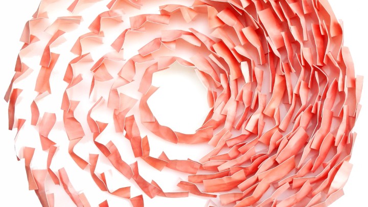
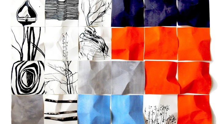
“Flesh 2.0” was intended as an expression of pure colour. I started by arranging painted squares of watercolour paper in a series of circles. I chose the square as my building block because I wanted a generic shape that didn’t represent any pictorial form. The circle is a distinct form, yes, but it has the advantage of… Read more Flesh
My studio is open to the public on July 23/24, 2016. I’m participating in the Toronto Art Blast studio tour. Please drop by between the hours of 11 AM and 6 PM. Seeing art online is one thing, but seeing it live is a whole other experience. Details are: Date: July 23/24 Time: 11… Read more Studio Tour 2016
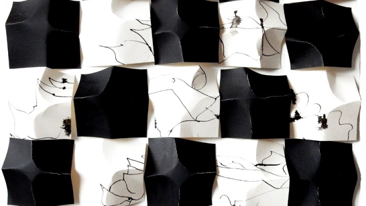
This is part of the ‘Black Rose Project’ which started out as a birthday gift for someone special, but took on a meaning of its own. One of the things I wanted to explore is how disruptive or destructive we can be in rendering the natural world and and still manage to convey its beauty and essence. On the… Read more Black Rose 1 (Series)
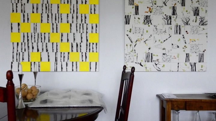
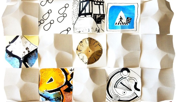
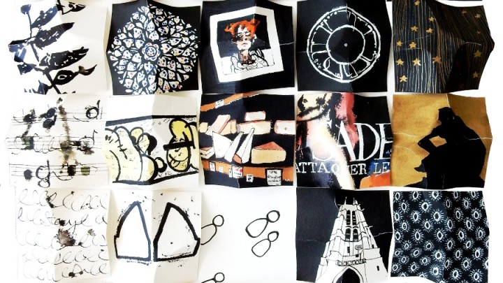
This work was created simultaneously with the other three in the ‘Hyperreal’ series. Like ‘Hyperreal 1’, which I wrote about in my previous post, it’s best understood as a single unit or block in a large building construction project. Like most real-life construction projects, the series is under construction ad infinitum, with new blocks being added over time. I listened the other day… Read more Hyperreal 2 (Paris)
This is the first in a series I began after returning from a trip to Paris. Shortly after beginning the piece, the Paris attacks happened and I couldn’t continue as planned and not acknowledge them in my work. I recently came across the term ‘hyper-reality’ from Jean Baudrillard via the American artist and writer, Peter Halley. The… Read more Hyperreal 1 (Paris)
I produced this piece after visiting the High Line in New York city. There was a view of a building under construction with a beautiful orange netting wrapped around some floors and a purple one on top. In the foreground, there was a low-lying grey structure and a billboard with a sky blue background. In… Read more New York New York
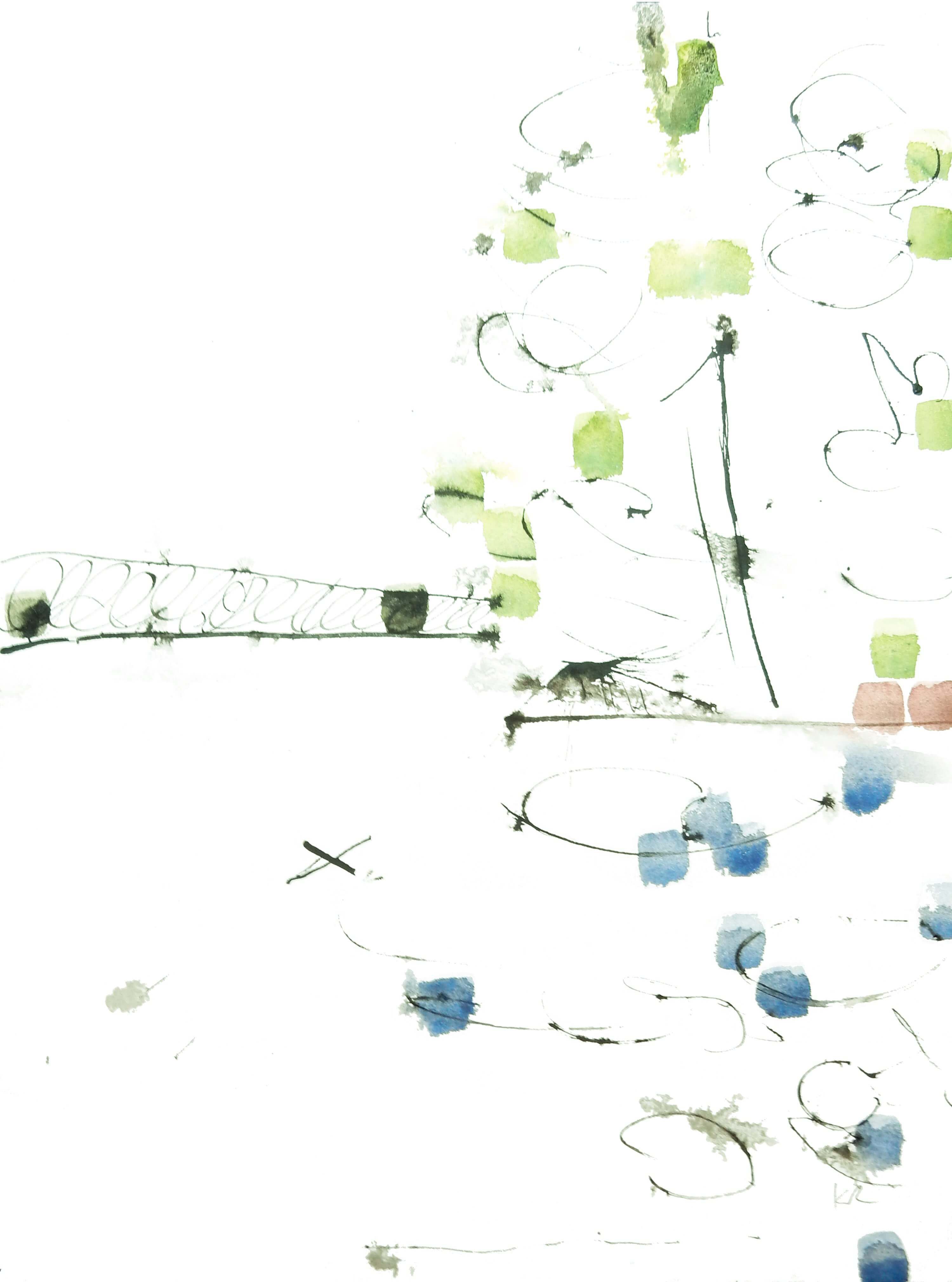
Here again I tried to convey pure colour separate from form. I made the brush strokes uniform, which seemed the best way to indicate colour without implying any intentions about its form. That is, the coloured squares can’t be mistaken for any shape in nature, like a leaf or a wave. When I first look at… Read more Artist’s Reality
