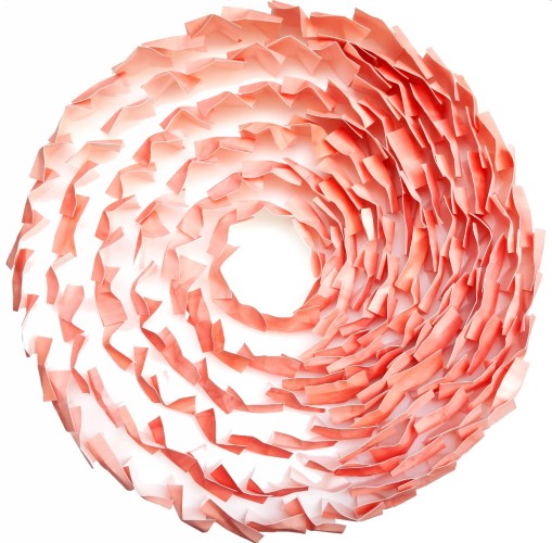
“Flesh 2.0” was intended as an expression of pure colour. I started by arranging painted squares of watercolour paper in a series of circles. I chose the square as my building block because I wanted a generic shape that didn’t represent any pictorial form. The circle is a distinct form, yes, but it has the advantage of signifying no point of reference, no beginning or end, and no specific orientation. There is only the gaping centre as a possible reference point.
Hopefully, the overall impression the piece gives you is that of the circle containing the colour, but not defining it. The colour dominates, especially, the longer you look at it. Reinforcing this notion (again, hopefully) is the creeping density of the flesh on the right-hand side, which also makes the piece look somewhat unfinished or in a state of flux.
I mixed the colour and named it “flesh” remembering the use of this tone in cubist paintings like Les Desmoiselles d’Avignon into whose colours I would, in my twenties, often take a mental dive, floating there between the pinks and blues. Flesh, of course, can be both a colour and a form, allowing me to give the colour a certain solidity without form.


